The interface talks too (and a lot)
In a digital product, the interface is a silent conversation with your customer. It’s what guides, reassures, orients… or frustrates.
That’s why translating a user interface (UI) into Spanish isn’t a minor task. Done literally or without strategy, the result can be a confusing, distant… and ineffective experience.
The key is adapting, not just translating. So every word does its job without losing your brand’s essence.
1. Accept that Spanish needs more space
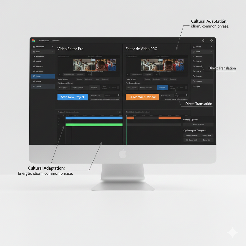
Spanish usually takes up 20-30% more space than English. Phrases like “Sign up” become “Crea una cuenta” or “Regístrate ahora.” And that change affects the design.
Tip: Design with flexible containers or generous margins from the start. And if needed, explore more concise alternatives without losing intent: “Entrar,” “Guardar,” “Unirse.”
2. Mind the logical order in Spanish
Translating words isn’t enough. You need to reorganize phrases, hierarchies, and instructions so they sound natural.
Example: “Profile settings” isn’t “Perfil ajustes.” It’s “Ajustes del perfil.”
Tip: Review whole structures. Effective localization also adapts the grammatical and cultural logic of the target language.
3. Adjust the tone without losing the essence
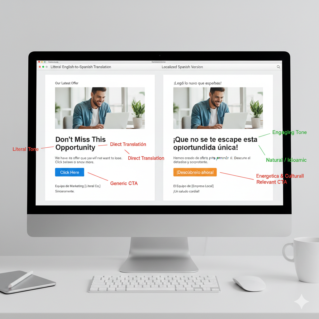
What sounds professional or empathetic in English can sound cold or condescending in Spanish.
Tip: Define the tone per language. Adapt greetings, error messages, confirmation buttons, or help text. It’s not the same to say:
- “Oops! Something went wrong”
- As: “Uy, algo no ha salido bien. Inténtalo de nuevo.”
4. Review microcopy as if it were headlines
Every word in an interface must be clear, useful, and consistent. Buttons, placeholders, tooltips, or labels can’t be an afterthought.
Tip: Validate every microcopy element with three questions:
- Does it make sense without context?
- Is it aligned with the product’s overall tone?
- Does it invite action, or does it create doubt?
5. Evaluate conversion before and after
A UI can be visually appealing, but if it doesn’t convert, it doesn’t work.
Tip: Run A/B tests if you can. Or at least compare key conversions before and after localization: clicks, completed forms, onboarding flows, etc.
UX localization: when design and language work together
Adapting an interface isn’t the exclusive job of the design team or the language team. It’s a meeting point between brand intention, functional clarity, and linguistic sensitivity.
That’s what I care about in every localization project for SaaS products or apps: making sure the language doesn’t just work, but connects.
Want your product to sound natural, fluent, and convincing in Spanish?
I offer a focused review of your key screens. Together we’ll check whether your interface sounds professional, clear, and on-brand.